Recently I wrote about ‘What Natural REALLY means?’ and as we learned, it really could mean anything, there is no definition. This becomes extra tricky when you bring in packaging.
We all want beautiful packaging sitting on our shelves. The packaging is what attracts us into picking up the item from the shelf to begin with. We pick it up, feel the material, like the bright colors, but it’s the buzz words that really get our attention – like natural, organic, cruelty free, non-gmo, made from real ingredients, the list goes on and on.
We have been trained to look at these words and make a decision; some of us don’t even flip the back to see why these buzz words are justified. And when you’re in a rush, if it looks right it might be all right, right?
What scared me the most as a founder of a beauty company is that the packaging cost more than the actual ingredients – how could this be? Something that I will eventually throw away, that doesn’t add anything extra to the product is costing more?! I mean we are paying for the ingredients and that’s what our dollars are going towards right??!! It is sadly not the case and thousands upon thousands of dollars are spent to convince you this pretty packaging is as good on the outside as it is on the inside – but many times it is not true. As someone who went from consumer to founder this was a hard truth to swallow.
I recognize we need something to help us pick a product off the shelf but industry ends up focusing and spending more on how it should look than what is going into the products.
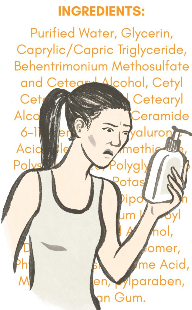
That is why I don’t judge a book by its cover. After I do see something pretty, I pretend that there are no bright colors or buzz words – but just a plain white bottle or plain white packet and so force myself to flip it and read what is actually in it. Suddenly I see the product for what it is. Remember packaging is only half the truth but the ingredients are always the FULL TRUTH.
At Feather & Bone, the packaging for our Face Gems is the tablet – everything else is just holding the tablet. We keep our design and materials simple. Because when you flip our packet all you see is 3 words on the ingredient list. My advice to you is remember its just the bottle or the packet that is holding the ACTUAL product – something that you will eventually throw away – which means the packaging doesn’t always have to be Instagram pretty, but the product DOES ALWAYS have to be kind to your skin.
I end with a question, would you rather have plain packaging and better ingredients or pretty packaging and mediocre ingredients?


